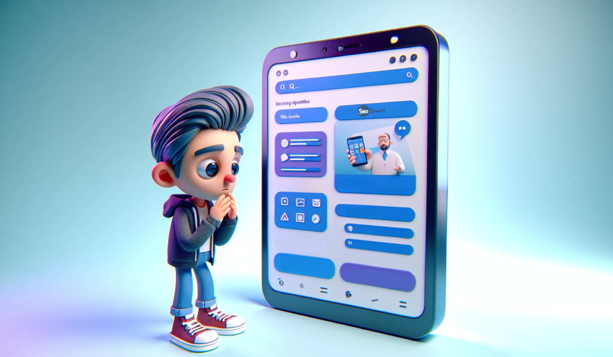
In 2025, up to 90% of your web traffic will come from mobile devices. But what portion of this traffic converts into actual sales? If this figure is significantly lower than your desktop version’s performance, the problem isn’t with your customers, but with the experience your site offers.
Every poor mobile experience creates friction—an invisible barrier separating the visitor from a purchase. The statistics are unforgiving: over 90% of mobile landing pages are unintuitive, overloaded, and make users want to close the tab.
In this article, we’ll analyze five common, yet not always obvious, mistakes that are tanking your mobile conversions. Fixing just one of them can significantly impact your revenue. We’ll also look at effective onboarding methods and an innovative design technique that optimizes the mobile experience.

Why the mechanical approach doesn’t work
For a long time, responsive design was considered just a technical task: take the content from the desktop version and stack its blocks one under the other. This approach is a strategic mistake. It completely ignores the context of use: a mobile phone is used on the go, with one hand, and with limited time and attention.
Simply scaling down elements doesn’t create a true mobile experience. It creates an imitation of one. Let’s look at how to avoid the key mistakes.
Mistake 1: Cognitive overload
Problem: Trying to fit all desktop elements onto a small screen, leading to excessive information density.
Consequences:
- Loss of visual hierarchy. Without enough “air” (white space), all elements become equally important, and it’s hard for the user to determine where to look first.
- Mental fatigue. When the brain receives too many visual cues, it goes into a defensive mode and signals the need to leave the page. This is called cognitive overload.
Solution: Content prioritization. Identify one, or at most two, key elements necessary for decision-making on the first screen. Everything else should either be removed or moved further down.

Mistake 2: Non-functional animations
Problem: Transferring complex, decorative animations from the desktop to the mobile version.
Consequences:
- Decreased loading speed. Every animation is an extra request that affects speed. For mobile users, who often have imperfect connections, speed is a crucial factor.
- Distraction from the goal. Decorative elements distract attention from the main objective—the call to action (CTA).
Solution: Use animation only when it serves a specific function: demonstrating how a product works or providing visual feedback to a user’s action. Aesthetics should not come at the expense of performance.
Mistake 3: Small interactive elements
Problem: Buttons, links, and icons are too small to be easily tapped with a finger (small tap targets).
Consequences: This creates a physical barrier to interaction. A user who fails to hit the right element several times feels frustrated and is highly likely to leave the site.
Solution:
- Optimal CTA size: For mobile buttons, a recommended height is 52-64 pixels. This ensures ease of tapping without creating “banner blindness.”
- Readable social proof: If partner company logos are so small they can’t be identified, they lose their value. In this case, it’s better to remove them from the mobile version.

Mistake 4: Irrelevant visuals
Problem: Demonstrating the product “from the inside” with a screenshot on the user’s mobile screen.
Consequences:
- Ineffectiveness. The user cannot make out the fine details of the interface in such a complex image.
- Lack of value. Such a visual doesn’t explain what problem the product solves; it only complicates perception.
Solution: Instead of complex screenshots, show the result or value. This could be a clear illustration, a key interface element that solves a specific task, or a “Pop-up” with an important message.
Mistake 5: Unadapted copywriting
Problem: Using the same text for both desktop and mobile versions.
Consequences:
- Difficulty in reading. The context of mobile reading demands brevity. Long sentences and complex phrases that are acceptable on a large screen turn into a “wall of text” here.
- Irrelevant CTA. A call to “Try for free” might be inappropriate if it requires a complex registration process that is inconvenient on mobile.
Solution:
- Create separate copywriting. Write shorter, clearer, and simpler texts specifically for mobile devices.
- Adapt the CTA. Offer a lower-friction action: “See how it works,” “Get a consultation.”
- Update your terminology. Instead of “click,” use “tap.”

Bonus tips for maximum effectiveness
To take your site’s mobile version to the next level, you should go beyond fixing mistakes and implement a few advanced practices aimed at minimizing friction.
The first step is to review “sticky” (fixed) elements. A fixed header certainly provides quick access to the menu, but at the same time, it “steals” precious vertical space on the screen. An effective solution is to keep only critically important elements fixed, such as the shopping cart button in an e-commerce store, freeing up space for the main content.
Instead of long forms, use progressive onboarding: at the first stage, ask for only the essentials, such as an email address. This opens up the possibility of using “Magic Link” technology—a login link sent to the email, eliminating the need to create and remember a password.
Any additional data can be collected later, once the user is already engaged with the product. Furthermore, all interactive elements, such as checkboxes, should be large enough (at least 32×32 pixels) to avoid accidental taps.
Finally, it’s worth considering an innovative design technique— micro-visuals. This approach suggests replacing large images, which often get lost during scrolling, with small, contextual visuals—icons, diagrams, or charts—placed next to the corresponding text. This allows you to maintain the visual connection between the message and the illustration, significantly save space, and increase the overall functionality of the page.


